Every modern browser has two functions on the window object, alert and confirm, that allow developers to show a standardised prompt to users.
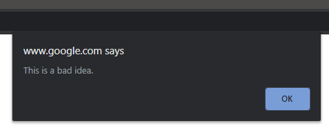
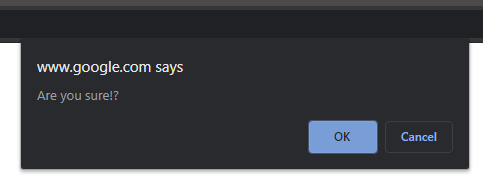
The alert function shows a simple blocking popup that contains important information, such as "This is not allowed.". The confirm function requires an input from the user in the form of a yes/no decision ("OK", "Cancel"), such as "Do you wish to proceed?", and then returns a boolean result.
These are super handy and easy to implement:
index.tsx
_11
<button
_11
onClick={() => alert("This is a bad idea")}
_11
>
_11
Launch Nukes
_11
</button>
_11
_11
<button
_11
onClick={() => confirm("Are you sure!?") ? launch() : beSensible()}
_11
>
_11
Launch them anyway!
_11
</button>
In chrome this looks like the following:
This is great as it's easy and functional, however, it's not pretty and we are at the mercy of the browser for styling and functionality. The rest of this post is a walkthrough on creating a drop-in replacement using react function components and typescript.
Alert in React
To take control of style and functionality, and make the dialogs be more on-brand, we can recreate this feature in React and turn it into a reusable drop-in component.
For this example I will be using Material-UI (MUI) to do most of the heavy lifting for styling and modal functionality.
The first thing we need is a component to instantiate:
index.tsx
_32
// set our material theme to dark mode
_32
const theme = createMuiTheme({
_32
palette: {
_32
type: "dark"
_32
}
_32
});
_32
_32
const AlertRoot: React.FC = () => {
_32
return (
_32
// pass in our dark theme
_32
<ThemeProvider theme={theme}>
_32
{/* Sets an absolute root component as a clickaway handler and
_32
a container for content, which is appended to our root element */}
_32
<Dialog
_32
onClose={() => console.log("CANCEL")}
_32
open={true}
_32
disablePortal={true}
_32
>
_32
{/* content components */}
_32
<DialogTitle>Title</DialogTitle>
_32
<DialogContent>
_32
<DialogContentText>A message!</DialogContentText>
_32
</DialogContent>
_32
<DialogActions>
_32
<Button onClick={() => console.log("OK!")}>
_32
{"OK"}
_32
</Button>
_32
</DialogActions>
_32
</Dialog>
_32
</ThemeProvider>
_32
);
_32
}
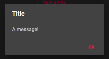
Above is a basic function component that displays a MUI dialog when rendered. It contains a title, a message and an "OK" button that will eventually clear the component when clicked.
Append the Component
We now need a way to instantiate our component as we want the new product to be as close to alert as we can.
NOTE: This is not really a react-y way of doing this as we are directly manipulating the DOM, but it works. I would love to know of a more react focused way of achieving the same result, i.e. calling a function to render a temporary blocking component that returns a promise result.
index.tsx
_20
// an ID to give our root element, can be what ever you like
_20
const rootID = "alert-dialog";
_20
_20
// a base function that appends our component to the document body
_20
function Create() {
_20
// see if we have an element already
_20
let div = document.getElementById(rootID);
_20
if (!div) {
_20
div = document.createElement("div");
_20
div.id = rootID;
_20
document.body.appendChild(div);
_20
}
_20
// render with react
_20
ReactDOM.render(<AlertRoot />, div);
_20
}
_20
_20
// expose a function that we can reuse in our apps to call the alert
_20
export function Alert() {
_20
Create();
_20
}
We could now call our Alert function in a component and we would get something like the following:
index.tsx
_3
<Button onClick={() => Alert("")}>
_3
{"Alert"}
_3
</Button>
Adding Data
Now lets update our component and exported function so that we can provide a message and if needed, a title. First we need to update our exported function:
index.tsx
_23
// add a message and title parameter. title is optional and defaults to "Alert"
_23
export function Alert(message: string, title: string = "Alert") {
_23
// we pass these parameters to the create function
_23
Create(message, title);
_23
}
_23
_23
// our create function now accepts the message and title variables
_23
function Create(message: string, title: string) {
_23
let div = document.getElementById(rootID);
_23
if (!div) {
_23
div = document.createElement("div");
_23
div.id = rootID;
_23
document.body.appendChild(div);
_23
}
_23
_23
// and we pass them to our component as props
_23
ReactDOM.render(
_23
<AlertRoot
_23
message={message}
_23
title={title}
_23
/>, div
_23
);
_23
}
With our functions updated, we now need to update our component to accept the new props and display the values:
index.tsx
_32
// add an interface that defines the new props
_32
export interface IAlertProps {
_32
message: string;
_32
title: string;
_32
}
_32
_32
// update the component to accept the props of our interface type
{/* add the new prop values to our title and message containers */}
_32
<DialogTitle>{title}</DialogTitle>
_32
<DialogContent>
_32
<DialogContentText>{message}</DialogContentText>
_32
</DialogContent>
_32
<DialogActions>
_32
<Button onClick={() => console.log("OK!")}>
_32
{"OK"}
_32
</Button>
_32
</DialogActions>
_32
</Dialog>
_32
</ThemeProvider>
_32
);
_32
}
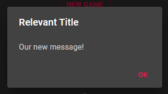
We can now update our call of Alert to take a message and optional title:
index.tsx
_3
<Button onClick={() => Alert("Our new message!", "Relevant Title")}>
_3
{"Alert"}
_3
</Button>
Closing the Dialog
The last piece we need to add to make the component complete is a close function. As our component is controlled from outside our root app and is self contained, to close it, we can just remove it from the DOM. For this we need a reference to our root element, which we will hold in a useRef hook. On mount we will get and store a reference to the element and on close, remove the element:
index.tsx
_15
// add the following after the props destructuring
_15
_15
// our root element ref
_15
const root = useRef<HTMLDivElement | null>();
_15
_15
// on mount, get and set the root element
_15
useEffect(() => {
_15
let div = document.getElementById(rootID) as HTMLDivElement;
_15
root.current = div;
_15
}, [])
_15
_15
// provide a function that remove the root element from the DOM
_15
function Close() {
_15
root.current?.remove();
_15
}
We can then update our Dialog and Button components to call Close() when dismissed:
index.tsx
_18
<ThemeProvider theme={theme}>
_18
<Dialog
_18
onClose={() => Close()}
_18
open={true}
_18
disablePortal={true}
_18
>
_18
{/* add the new prop values to our title and message containers */}
_18
<DialogTitle>{title}</DialogTitle>
_18
<DialogContent>
_18
<DialogContentText>{message}</DialogContentText>
_18
</DialogContent>
_18
<DialogActions>
_18
<Button onClick={() => Close()}>
_18
{"OK"}
_18
</Button>
_18
</DialogActions>
_18
</Dialog>
_18
</ThemeProvider>
We now have a fully functional drop-in replacement Alert() that can be and fully customised to remain brand-centric.
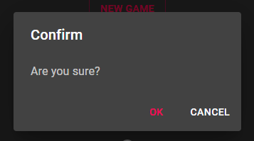
Extending with Confirm
To be able to get the users response to a confirmation prompt, we need to extend our component to await an input and return the result.
We can now add a new exported function for Confirm and extend our Create function and our components props. To do this we create a new Promise<boolean> on mount and resolve it with a boolean result when a use clicks the button, which is then returned to the calling function.
The result is our alert pops with OK and Cancel buttons and awaits input. Once selected the result is sent back to the calling function and is allowed to continue. Bear in mind that the Confirm implementation is now an async/await operation as we need to return the promise result. The Alert function is not a promise so it can be dropped in as a direct replacement.